It was the first big snow of the season in Vermont. In my city the leaves turned late and the snowfall landed early, giving us the rare gift of “snowliage”. As I walked to work that morning I came upon two people separately stopped on the sidewalk to take photos of an overhanging Japanese Maple tree, resplendant with snow caps over a full set of leaves. They marveled at how it looked, and I knew then that the tree was in a deep red hue at the onset of winter. I took no photos. I smiled and walked on.
The leaves to me looked dark gray or brown, approaching black.
My wife worked as a babysitter on the side back when we first started dating, minding some single-digit-aged munchkins. At one point she mentioned that her boyfriend (👋) was colorblind, and they asked, adorably, “Does he use a cane?”
The answer of course is that I don’t, but that story illustrates the not-quite-a-disability confusion of the fact that I am a [proud?] Protanope. Like 2% of the male population, I am fully missing the red-perceiving cone in what is supposed to be a three-channel sensor system in my eyes. As a result, I mostly can’t see any difference in hue between a rose and the leaves around it, and Cookie Monster and Grimace appear to be the exact same color to me. This is not the world’s biggest headache for the most part, except for when I’m in the woods, determining the safety of berries based on how closely they resemble gummy bears.
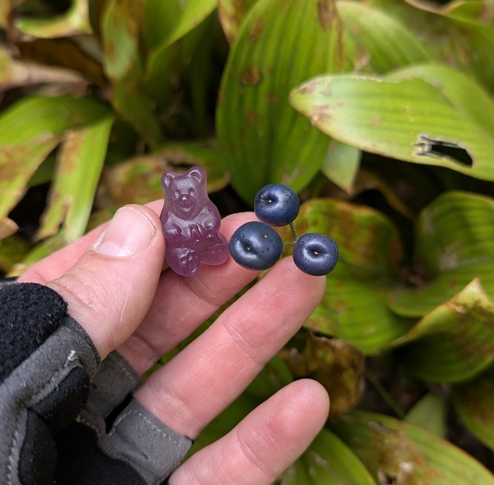
GTG, right?
However, some among you will have already detected a major issue, and perhaps asked yourselves: “How does this deficiency affect his occupation?” After all, I am a colorblind cartographer.
What this looks like
I deal primarily in satellite and aerial imagery. I frequently adjust that imagery depending on my intended purpose, which isn’t always aesthetic.
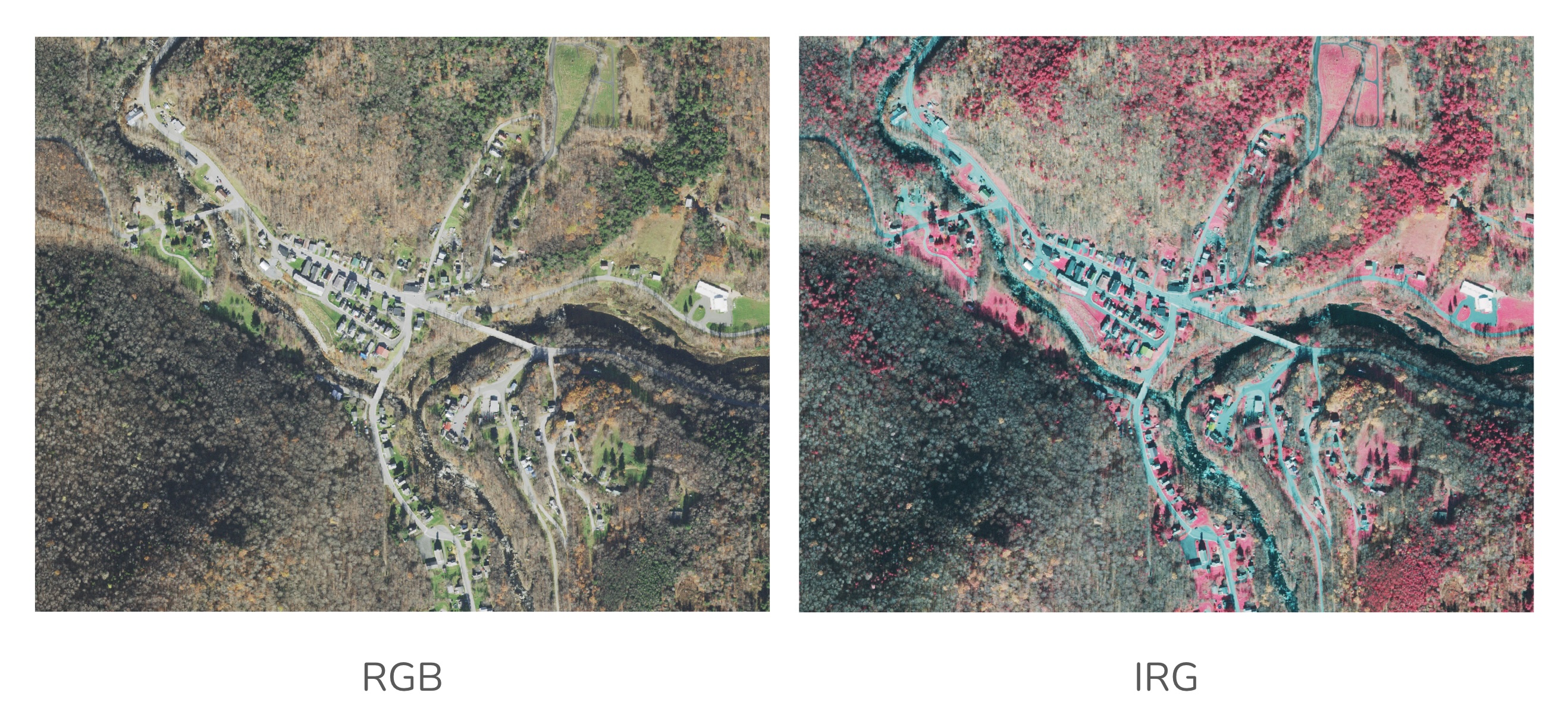
These images look almost exactly the same to me, though I know the one on the left is “true color”, and the one on the right is a false-color infrared composite:
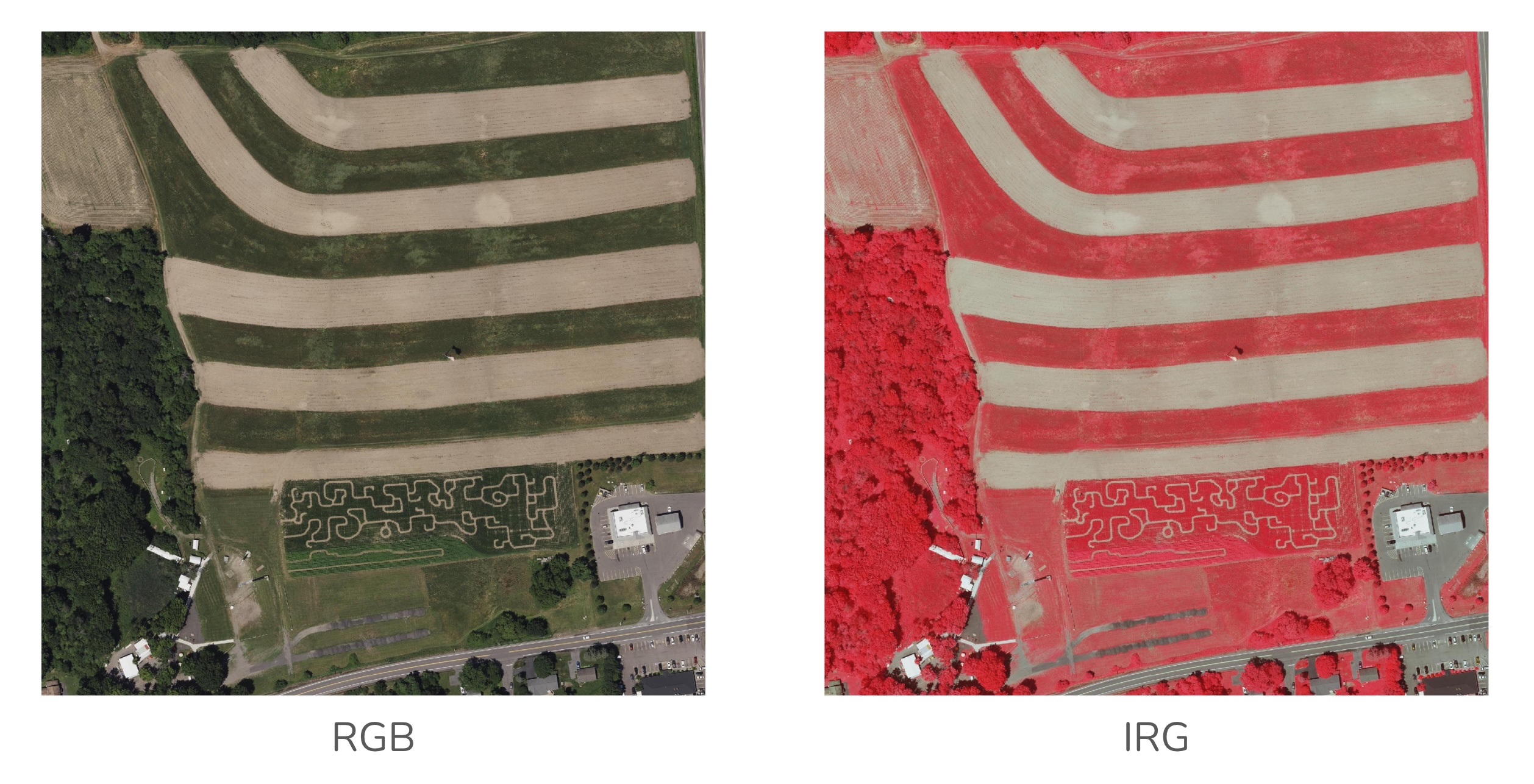
These seem a little bit different to me:
And these are functionally identical:
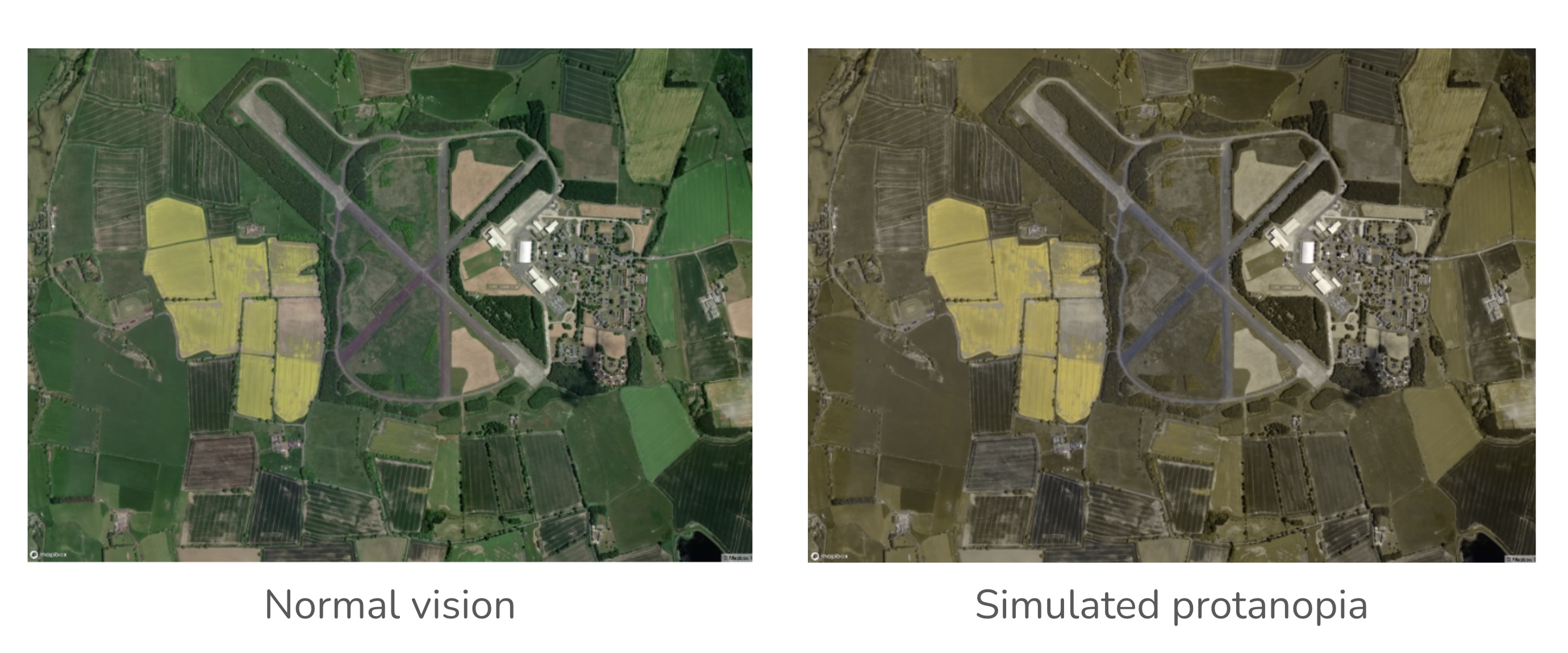
In some cases, it’s a problem that those airstrips and fields all look the same to me. I am restricted from flying for the Air Force, but there are reasons beyond my vision why that gig wouldn’t pan out. Mostly in my work it’s more important to be able to recognize pattern and texture, which - according to this highly convincing n=7 study from 1992 😉 - I am purportedly better at doing than my trichromatic fellow humans.
What I do about it
This is the tiniest of oversimplifications, but color in the digital sphere is basically just numbers.
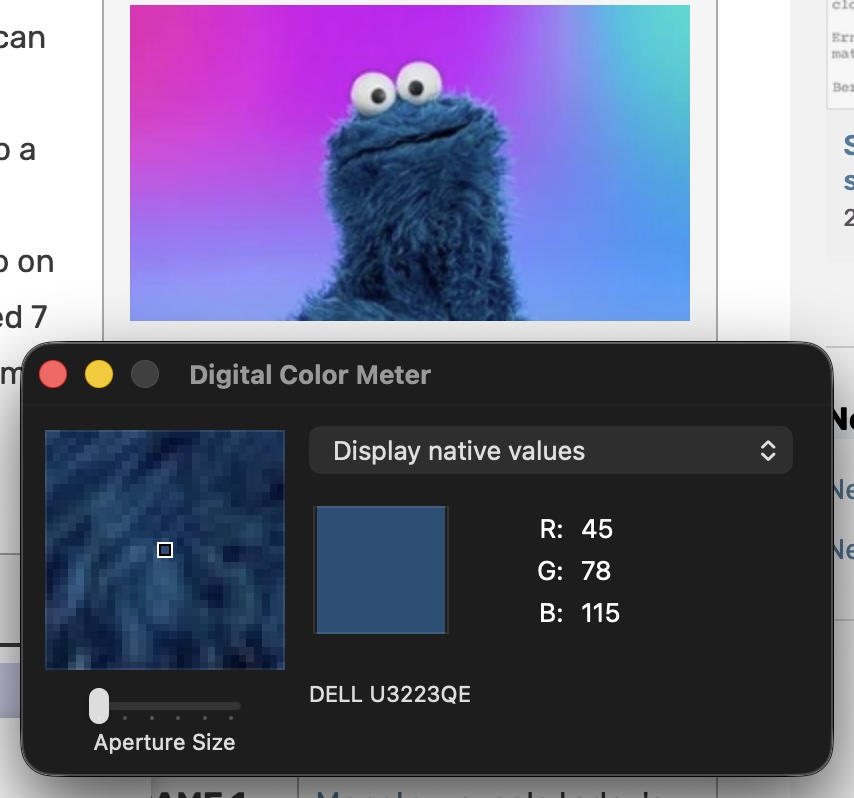
In order to slap a name on a color that I see on my screen, I have an OS-wide color picker that can give me the value of any pixel in any colorspace. There exists a plethora of tools to take this a step further and identify which spans of the color wheel serve best to compliment or contrast with any given color value. There are ways for the color-sighted to see simulations of colorblindness as well, with the opportunity to account for it in their choices.
In the cartographic world, we are particularly fortunate to have the work of Dr. Cynthia Brewer available as a handy web toolkit for planning out thematic color schemes, as well as more recent work by Joshua Stevens on complex thematic pallettes.
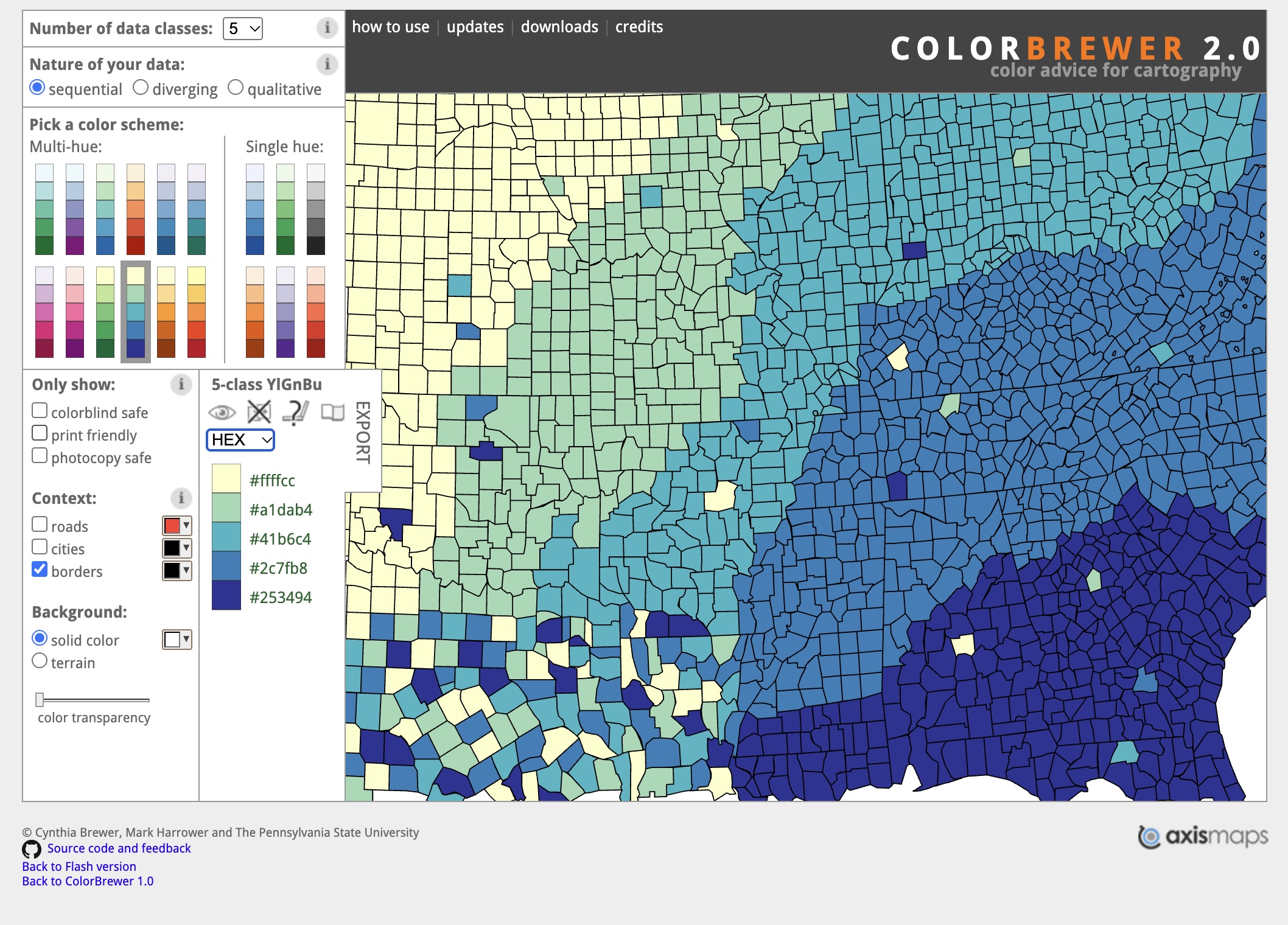
There is something of an underground of colorblind cartographers, who I will not identify here, but who freely share their experiences and wisdom. No normally-sighted colleague has ever questioned my fitness for the job, or indeed ever made me feel unsupported. We should all be so lucky.
I’ve spent most of my life, perhaps not celebrating, but at least appreciating the difference of my perspective. I know that my world looks different from everyone else’s, but it’s never felt like a less than.
However in working on this piece I finally, earnestly solicited some opinions from friends and colleagues about what they saw in the same images that I was looking at - in particular in the comparison between the true color image of the airstrip surrounded by blooming canola fields, with the protonopia-simulation version next to it. The words I heard to describe my simulated view of the world were “leached”, “desaturated”, and “sepia”.
This was honestly shocking, and perhaps the first hint I’ve had since I was very young that the world might be more vibrant than I could ever imagine.