Indulge me on a brief tangent: My parents are braggarts.
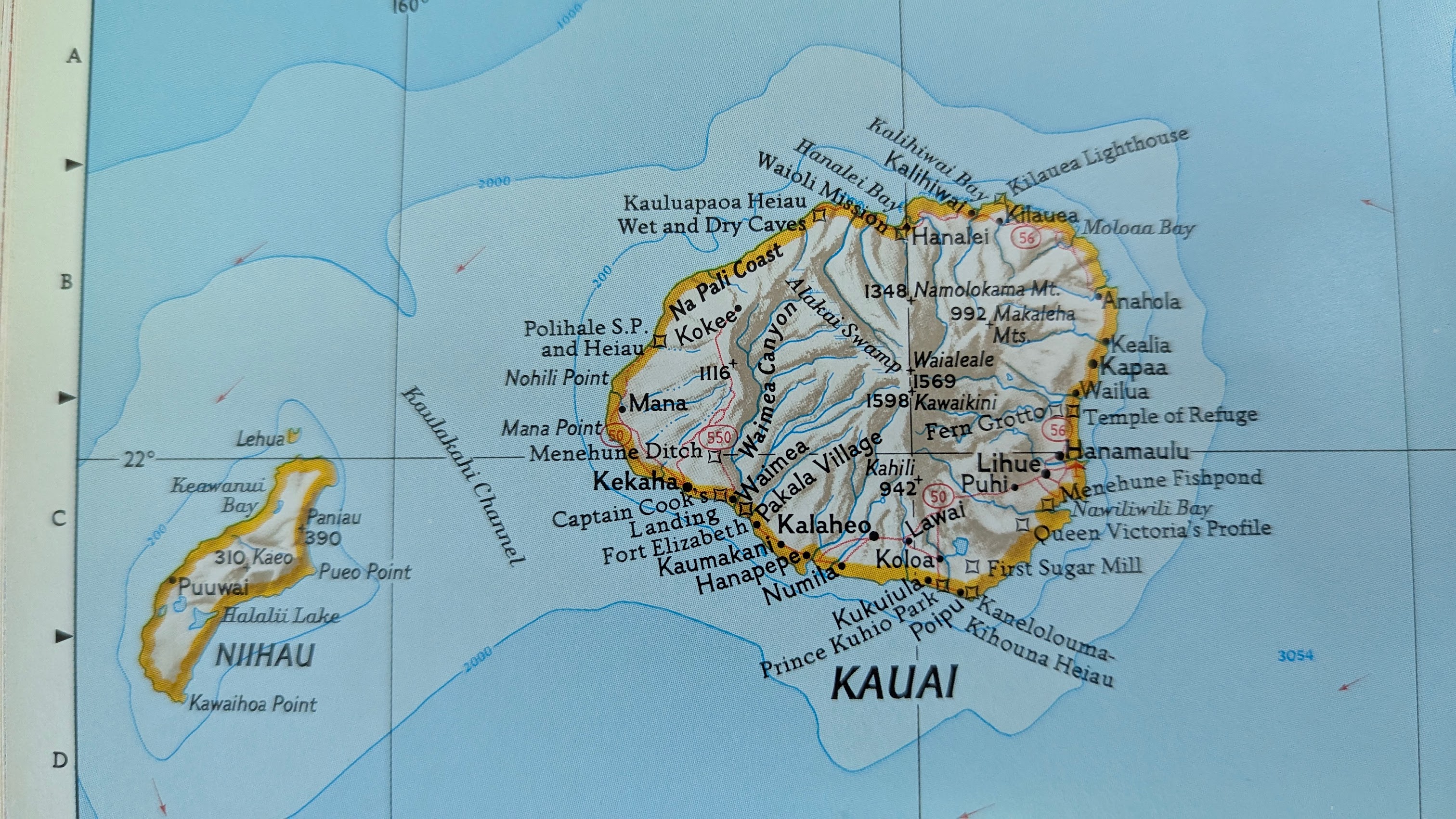
About me, specifically. This is standard parent behavior, which I understand better now that I have kids of my own about whom I’m immensely proud. But my point here is that in a childhood of music and hockey, I did not give them much material by which they might have bragged “he’s going to be a cartographer someday”. The one exception is when I won my school’s geography bee and went to the state tournament; I bombed out for reasons I no longer recall, but the consolation prize is still in my library today: A massive 1985 National Geographic Atlas of North America.
I was paging through it again over the weekend and got caught up on the terrain shading of one of the locus maps. I had a question that has often occurred to me before in one variant or another: “How did they do that in 1985?”
The path to an answer was shorter than usual this time. The helpful credits page gave me a few names to search, and one stood out for its Hungarian-ness and likelihood of a unique web search: Tibor G. Tóth.
And Mr. Tóth himself was able to answer my question, with a detailed piece from 2010 in Cartographic Perspectives about his methods over the years (PDF). It’s worth a full read, but some parts stood out for me:
Learning Imhof
Because National Geographic Society had no in-house expertise in [the Swiss topographic style], they engaged the services of a retired Swiss cartographer, Paul Ulmer, to instruct a number of us in the relief presentation style made famous by Professor Eduard Imhof, Swiss Federal Institute of Technology (Eidgenössische Technische Hochschule), Zurich. At the end of the training program, Ulmer selected me to draw the relief for the map of Mt. Kennedy published in August 1968.
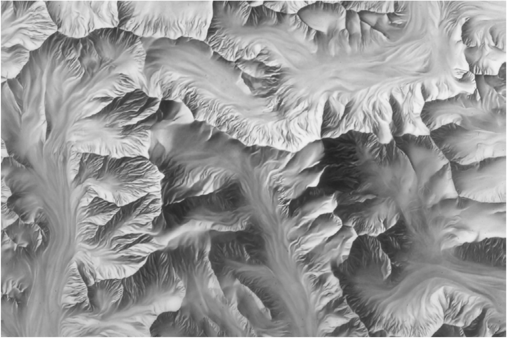
The massif of Mount Hubbard, Mount Alverstone, and Mount Kennedy. 1968
Switching tools
When compared to the pencil shading technique, the airbrush’s greatest benefit is that it cuts back on the production time by as much as one half. Unlike the reflective art produced by graphite pencil, which requires special care in camera reproduction, airbrush art has a matte surface conducive to photography.
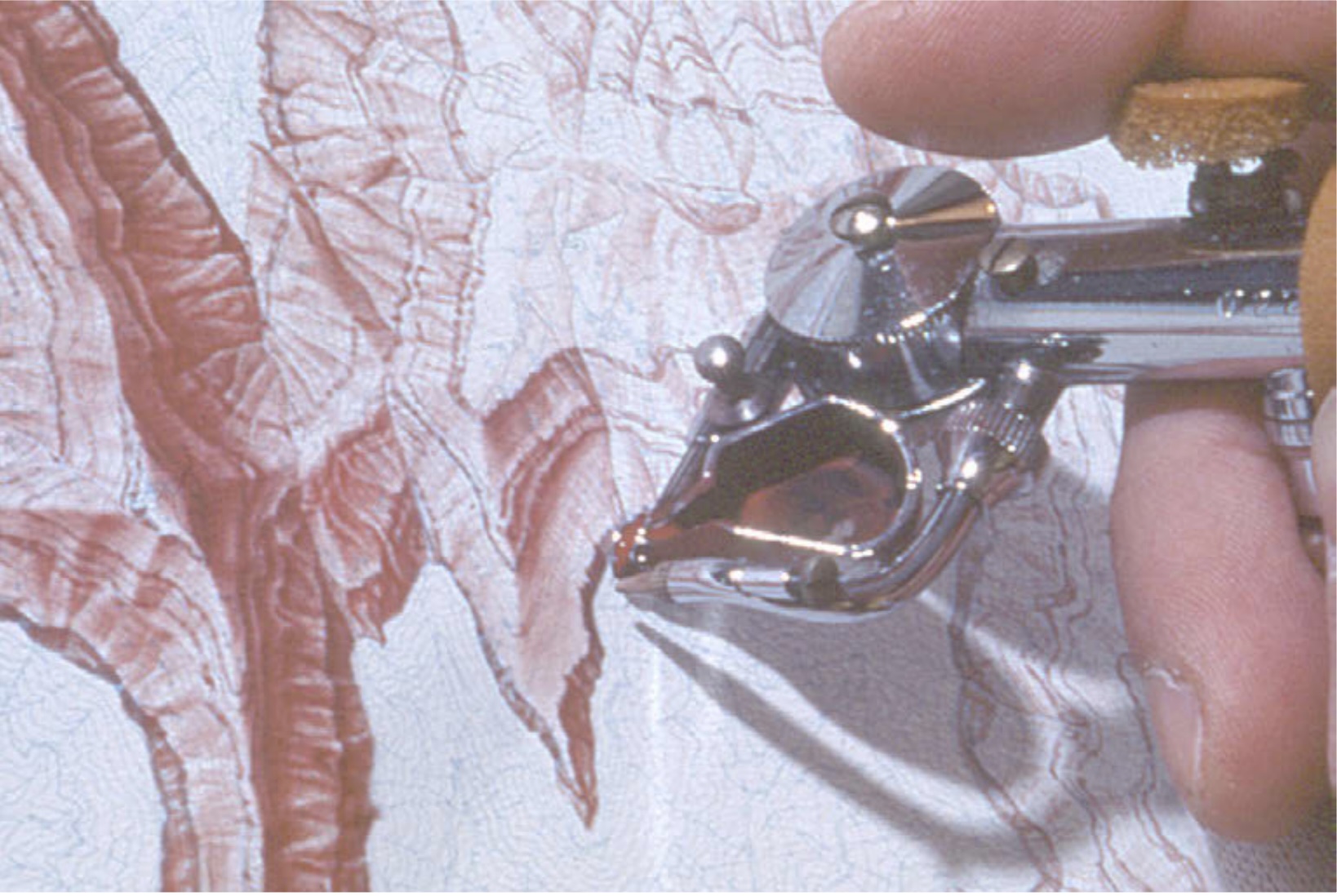
Precision airbrushing on The Heart of the Grand Canyon. 1978
Fixing data by hand
[Re: his shift to digital mapping in the 1990s] . . . I start by producing a base relief image with resolution-bumped DEMs (Patterson 2001). As good as these images may appear at first glance, closer inspection reveals data-related deficiencies requiring retouching or, in extreme cases, more extensive over-painting. For these tasks I am grateful for all those years of conventional relief experience.
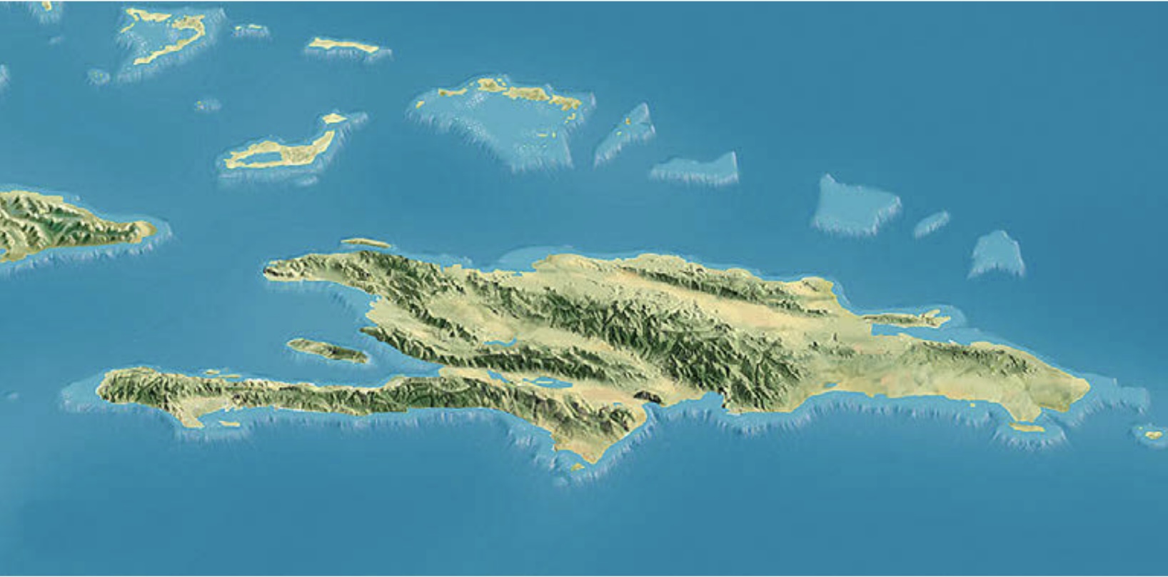
Central portion of West Indies. National Geographic Magazine. 2003
Mr. Tóth’s career began in communist Hungary and culminated in the golden age of National Geographic cartography. He continuously adapted to new technologies and learned new methods, literally going from pencils to computers in a way that feels a bit familiar to those of us who just barely remember the pre-internet age but now code with LLMs. And as he puts it:
At age eighteen, I was a gymnast in Hungary planning to go to college to become a physical education teacher. Had this come to pass, today, over five decades later, I would be long retired and reminiscing about somersaults and handstands.
Maybe geographers never give any hint of where they’ll emerge. Maybe it’s always a happy accident. I’m grateful to Mr. Tóth for sharing his journey.
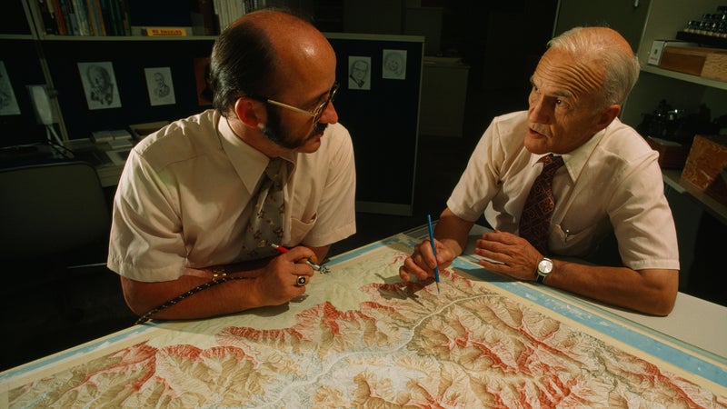
Brad Washburn and Tibor G. Tóth discussing their magnum opus: The Heart of the Grand Canyon, 1978