A recent post from the world of crowdsourced mapping has me thinking about food availability and the nature of poverty in the United States. The Brooklyn Food Coalition has begun a community food survey, collecting location and stocking information for food stores throughout the borough. The aim is partly to identify zones where - for reasons of distance, transportation or pricing - it is difficult to locate healthy food.
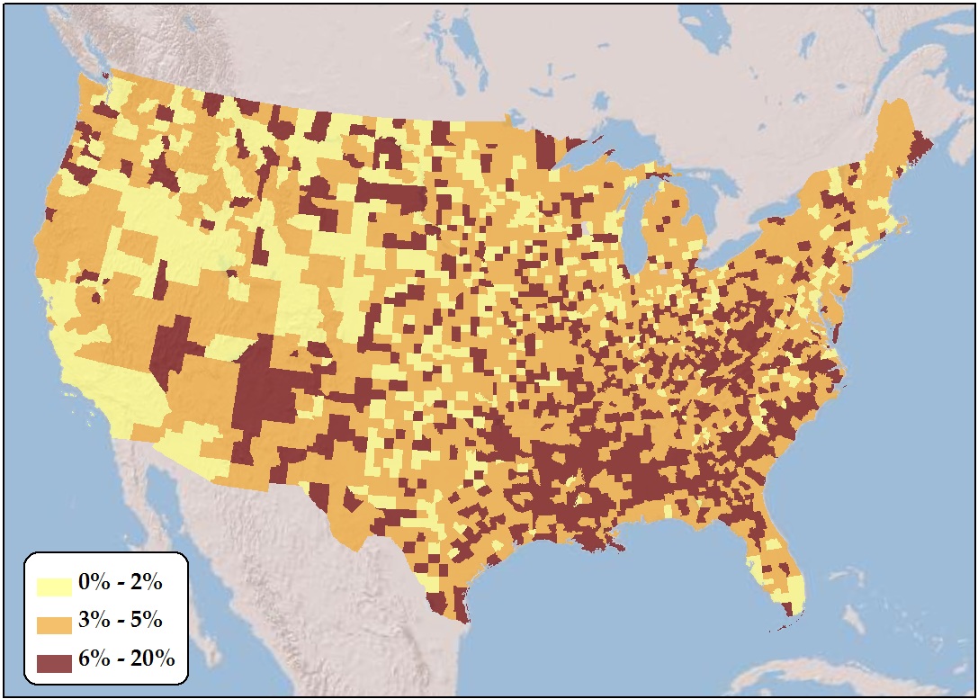
The general term used to describe zones like these throughout the country is “Food Deserts.” This also refers to the economic state of people; a household is said to live in a food desert if it doesn’t have access to a car or public transportation, and lives more than a mile from a grocery store. According to the USDA, there were 2.3 million such households in 2009. Here’s what that looks like spatially, broken down by county:
 Percent of households a.) without access to a car, and b.) living more than one mile from a grocery store (Data: USDA
While there’s lots of local variation, the emerging theme is one where relative poverty and food deserts coincide spatially, particularly in the South and in Appalachia. Huge chunks of rural America lack access to fresh foods, relying instead on smaller stores with a greater abundance of processed foods. The Brooklyn Food Coalition is also noting this trend on the community scale, and with greater detail about the specific character of food availability.
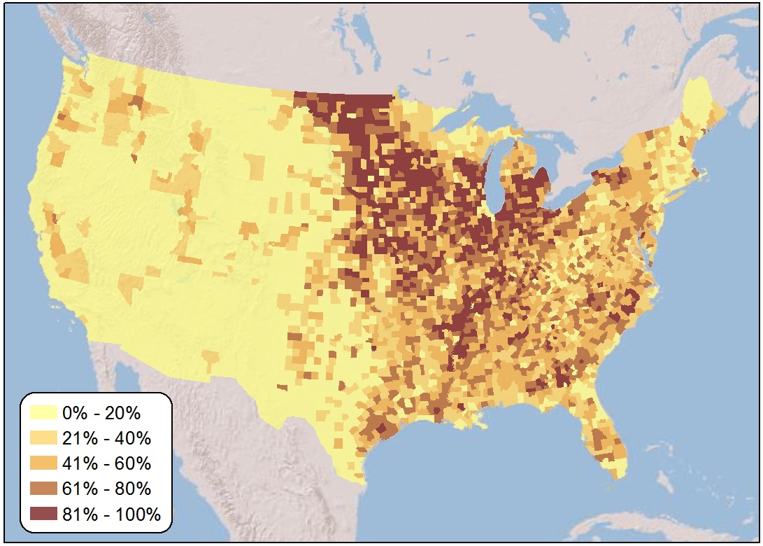
There is a dichotomy here, and it will require further investigation: How do food deserts line up spatially with agricultural production? Here is a tiny look in that direction, using a geographically-weighted regression:
 Percent of county land area in crop cultivation (Data: NASA)
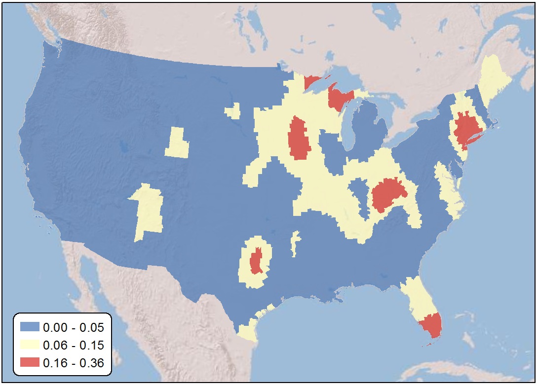
And what I’ll call the “Map of Socio-Agricultural Irony”, or where existing food deserts coincide with high levels of total crop cultivation:
 Geographically-weighted local R-squared: percent area in cultivation vs. percent of population in a food desert per county
Amber waves of grain everywhere, and not a kernel to gnaw on . . .